01 – Giverny Bake Co.
Logo
Nestled in the hometown of Claude Monet, Giverny Bakery Co. provides the best french baked goods in a creative, welcoming setting to their visitors from near and far.
Monet’s lily pond was always close to his heart, hence the use of a lily pad symbol.
02 – Giverny Bake Co.
Business Card
As a higher-end bakery, the goal with this design was a modern, but classy and simple layout, utilizing the same logo symbol, colors, and secondary font as used for the logo. Rounded corners add a eclectic air to these cards.

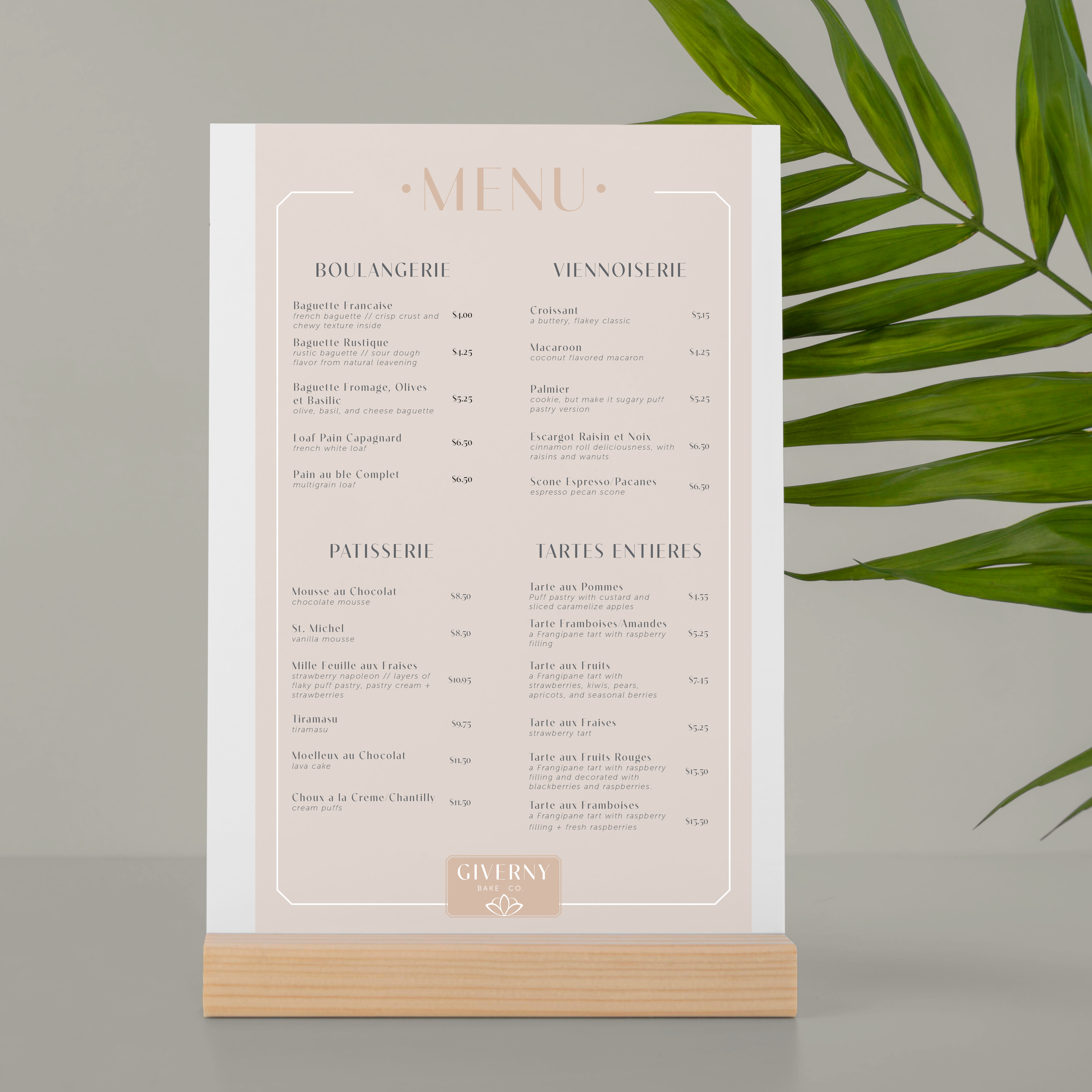
03 – Giverny Bake Co.
Menu
Arguably, the most highly viewed material of any company selling food! This menu stayed consistent with the same typography and color palette established in earlier products.
Effective hierarchy was another main goal.
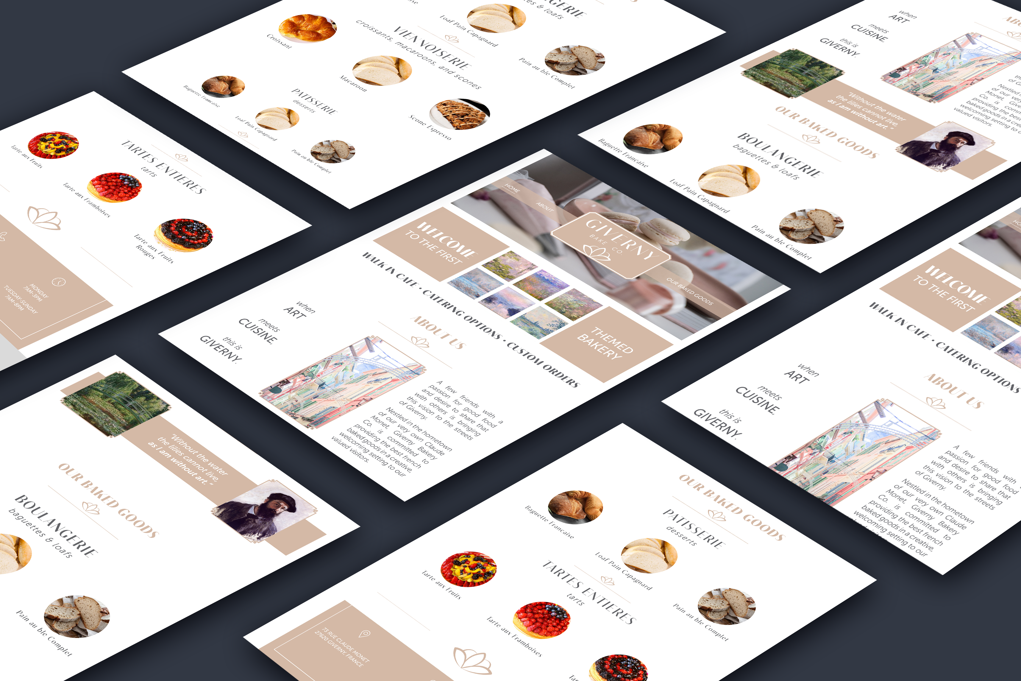
04 – Giverny Bake Co.
Website
Next in this identity package was the website design. I kept the style consistent, while adding some more bold touches. Squares of Monet’s paintings adorn the home page, while another soft painting of Giverny’s streets tells the story along with a quote by the painter.
05 – Giverny Bake Co.
Signage
Entering the bakery, the shopper is greeted with a sign made from the logo.
My goal with this project was to establish a simple, yet easily recognizable symbol that would be memorable to customers. There is no price that can be put on a commonly recognizable brand visual.