It’s more than just graphics.
Project 1 – Spirit Airlines
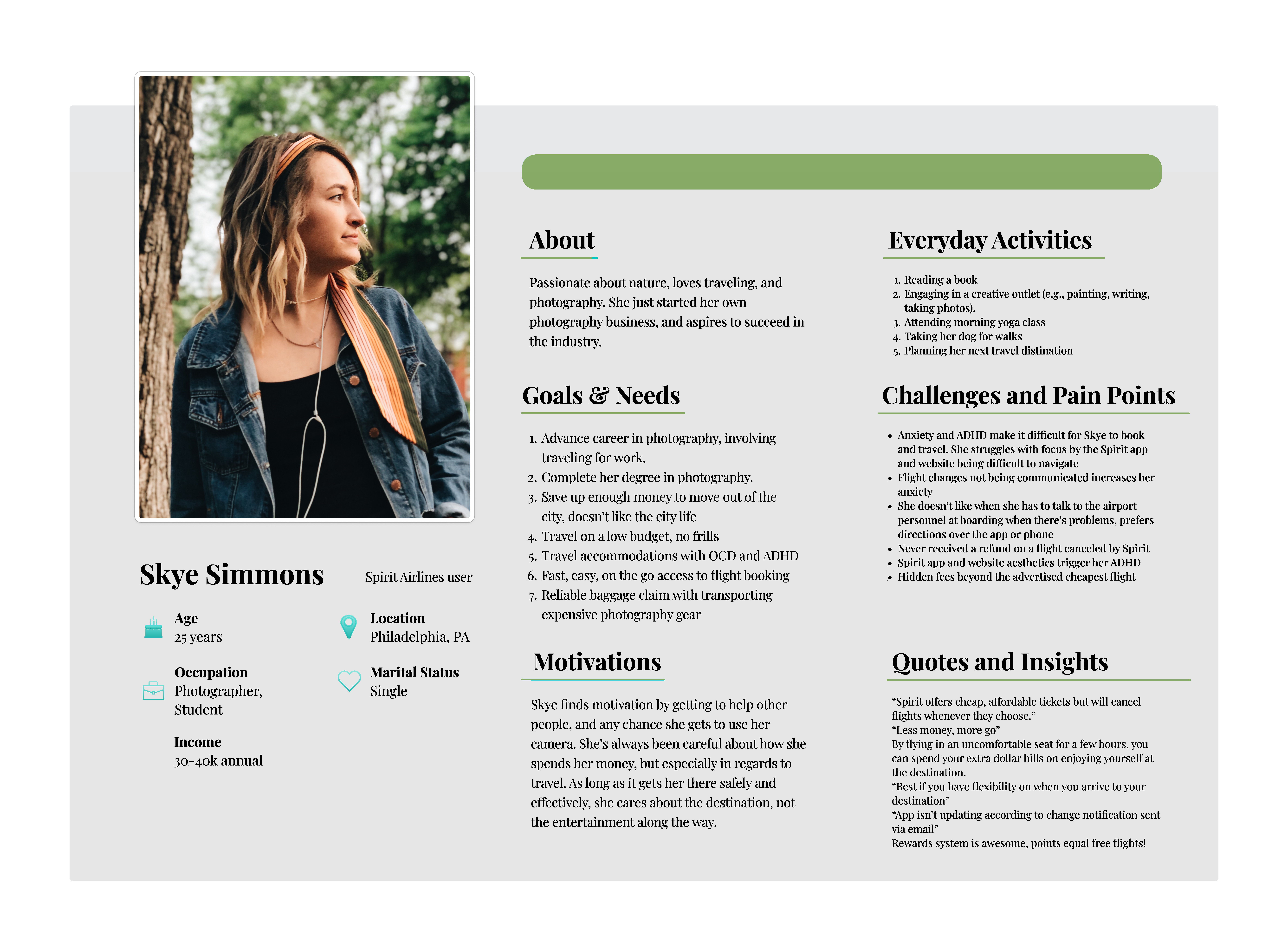
a) persona
b) competitor analysis

c) proposal
The end result of this project was a proposal for the company to undertake to increase the experience of their users on their multiple digital platforms, based on the feedback I received.
Project 2 – A Week Away Foundation
“A Week Away Foundation provides vacation to families who have a member struggling with a life-threatening illness.”
– A Week Away Foundation
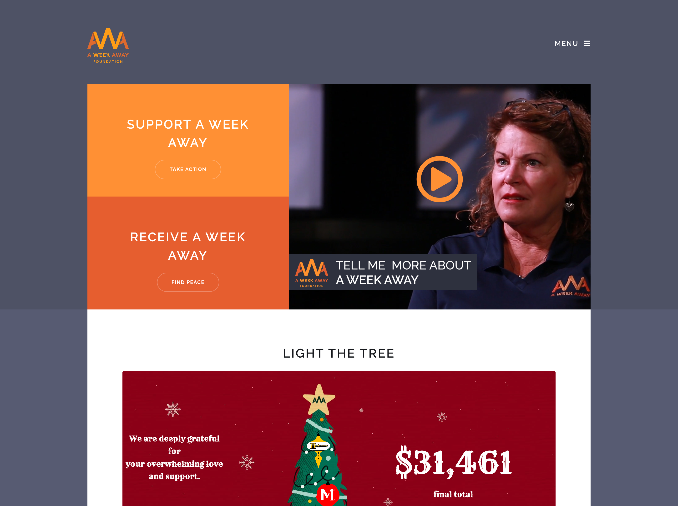
This project involved the redesign of the foundation’s website to increase user experience.
Because individuals of a great age gap may be using this digital space, my goal was to simplify navigation and content organization.
Step 1 – User Testing

Through data gathered from user interviews on the current webpage, I identified user pain points that are diminishing the user experience.
Step 2 – Site Mapping
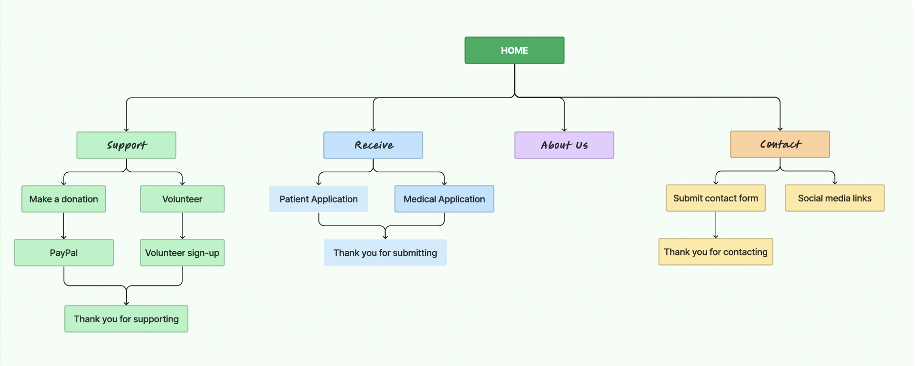
This sitemap accomplished the goal of simplifying organization. My sitemap changed the organization of content to a header and main pages users would be looking for, ridding the need of multiple links and the side menu bar. Instead, this design encourages more scrolling throughout content and a fixed header.
Step 3 & 4 – Wireframing and Lo-Fi Prototyping

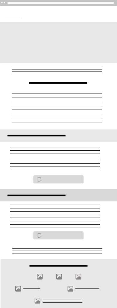
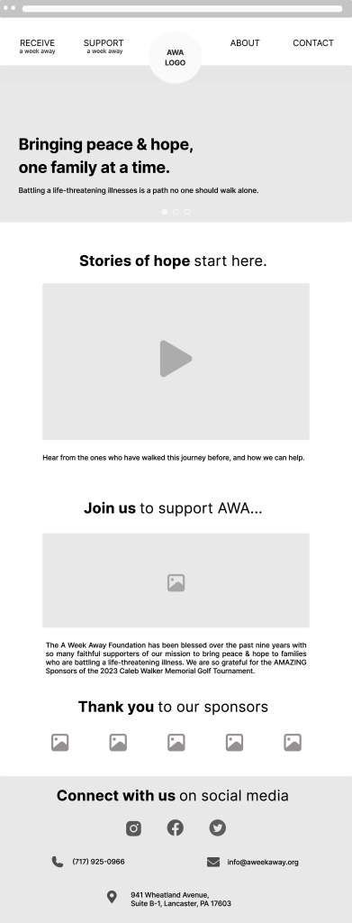

Using Figma, wireframing and lo-fidelity prototyping further developed my goals in organization and navigation. I discovered through ideation that fewer images with less large bodies of text worked the best for this goal. Incorporating the main content people come to the website for onto the main page also achieved this result.
Step 5 – High-Fidelity Prototype
before & after

Step 6 – Further User Testing
Interviews were conducted on users of the website, and data was analyzed comparing the first user testing of the website before redesign to after.
The results overwhelming indicated user frustration decreased by 80%, while navigation time to complete tasks also decreased by approximately 60%.
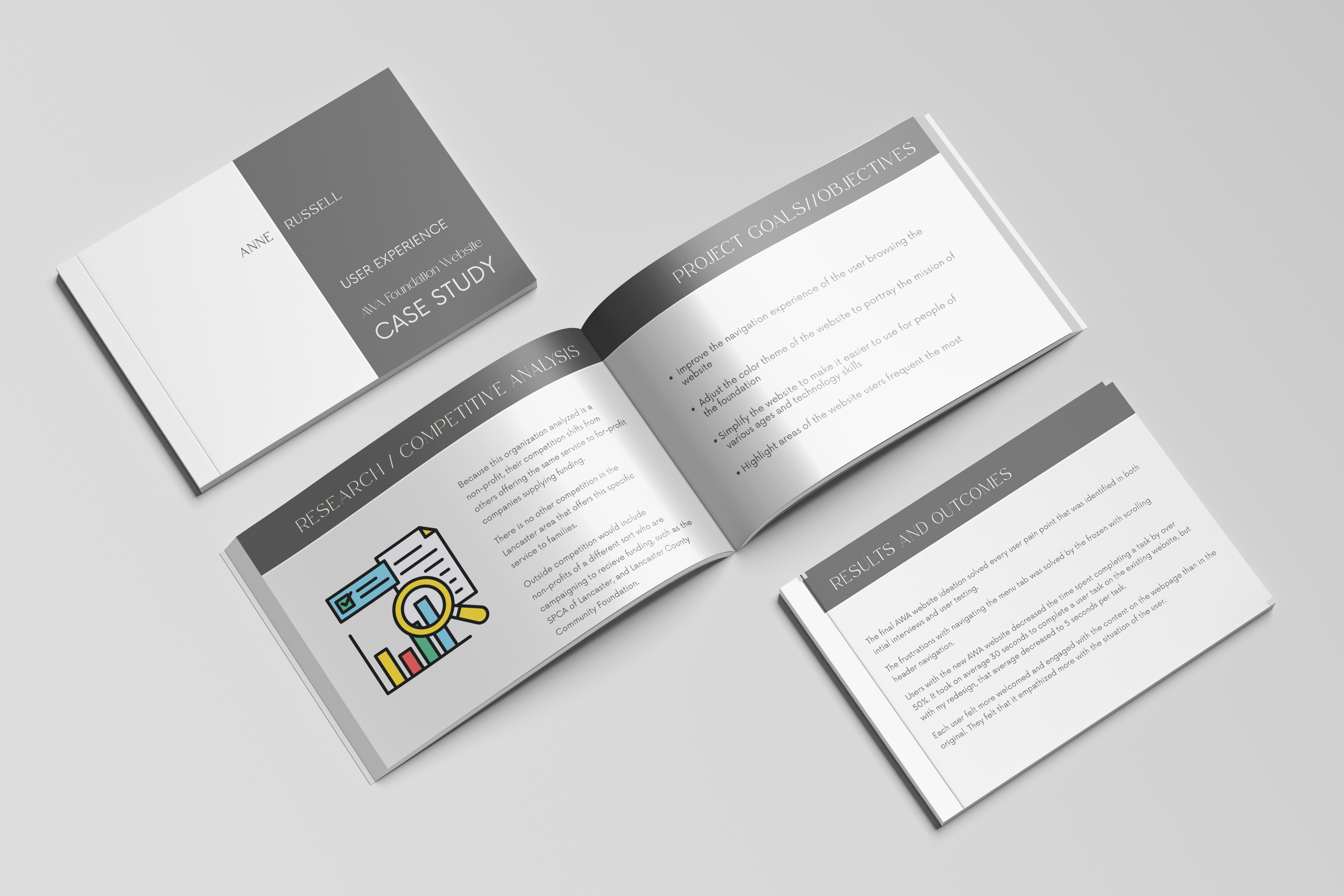
Step 7 – Case Study
After seeing the overwhelming success rate of the website, I conducted a case study analyzing every process in the project, and why the design decisions I made worked.